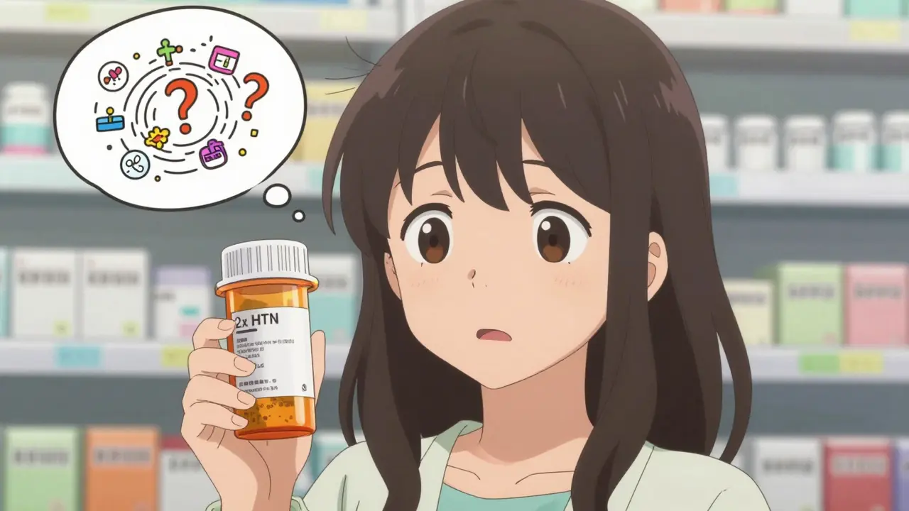
Have you ever noticed that your prescription label looks completely different from the one your neighbor got? Or maybe you picked up the same medication from two different pharmacies and the instructions seemed to say two different things? It’s not your imagination. Prescription labels in the U.S. aren’t standardized - and that’s a serious problem.
Why Your Bottle Looks Different
Every time you fill a prescription, the label on your bottle is shaped by a messy mix of federal rules, state laws, and pharmacy software. There’s no single national template. One pharmacy might use bold text for dosage, another might put the reason for the prescription in tiny print. One might use Arial, another might use Times New Roman. Some include your doctor’s name. Others don’t. Some labels are bilingual. Others aren’t.This isn’t just about aesthetics. It’s about safety. When labels change format between refills, patients get confused. A 2021 survey found that 68% of people have trouble understanding their prescription labels at least sometimes. And 22% admit they’ve made a medication error because the label was unclear.
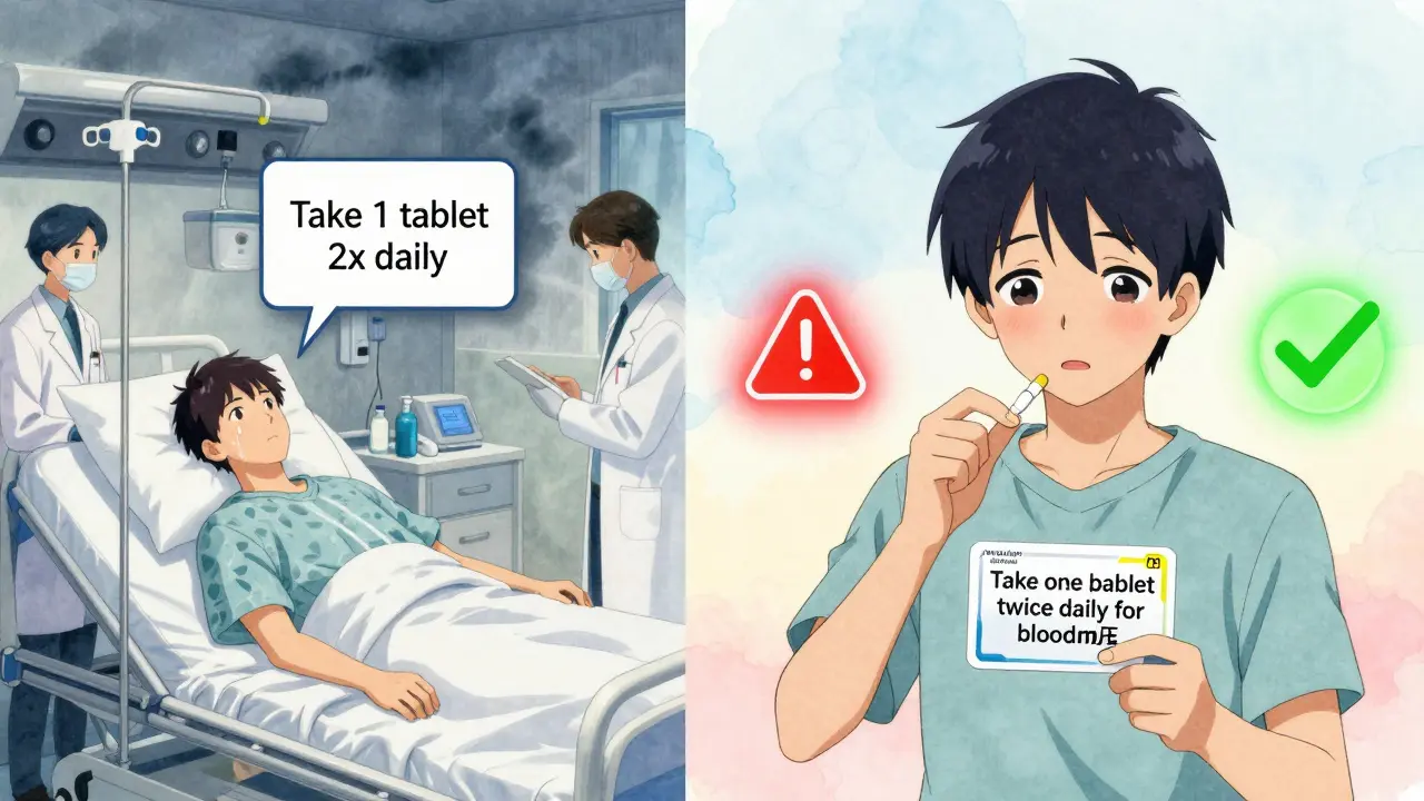
Take this real example: a man in Texas took double his blood thinner dose because his pharmacy changed the label format. One refill said “Take 1 tablet twice daily.” The next said “Take 1 tablet 2x daily.” He didn’t realize “2x” meant the same thing as “twice daily.” He ended up in the ER.
Who Sets the Rules?
You’d think the FDA would have clear rules. After all, they regulate drugs. But here’s the catch: the FDA’s labeling rules (21 CFR § 201.56) are meant for doctors and pharmacists - not patients. They focus on scientific details like drug interactions, side effects, and dosing for professionals. The label you hold in your hand? That’s mostly governed by state pharmacy boards.There are 50 different sets of rules. California requires Spanish labels for certain medications. Texas demands a minimum 10-point font size and mandates the pharmacy’s phone number be clearly visible. New York has its own spacing rules. And none of these states are required to follow the same format.
Enter the USP - the United States Pharmacopeial Convention. In 2012, they released General Chapter <17>, a set of science-backed guidelines for patient-friendly labels. Their research showed that small changes in layout could cut medication errors by 30-40%. They recommended:
- Using sentence case: “Take one tablet twice daily” instead of “TAKE ONE TABLET TWICE DAILY”
- Black text on white background - no light gray or colored backgrounds
- Non-condensed sans-serif fonts like Arial or Helvetica
- 1.5 line spacing so text doesn’t crowd
- Always including the reason for the prescription: “for high blood pressure” instead of “for HTN”
- Using simple words - no medical jargon
These aren’t suggestions. They’re based on studies of how real people read labels. Yet, as of 2023, only 28 states have adopted them fully. And even then, enforcement is spotty.

The Tech Problem
You might think pharmacies just print labels using one system. But there are over a dozen different pharmacy management software platforms in use across the U.S. Each one formats labels differently. A pharmacy chain like CVS or Walgreens might use one system in California and another in Ohio. Even within the same store, switching software during an upgrade can change how your label looks.Pharmacy techs report that 73% of customers return to ask, “Is this the same medicine?” after a refill because the label layout changed. That’s not customer service - that’s a safety risk.
What’s Being Done?
Progress is slow, but it’s happening. In 2022, the Biden administration made standardized prescription labeling a key part of its Patient Safety Action Plan, aiming for 90% state adoption by 2026. CVS Health announced in April 2023 that it would roll out USP <17> standards across all 10,000+ of its pharmacies by the end of 2024. Their pilot in 500 stores cut patient confusion calls by 33%.The FDA also took a step forward in June 2023, releasing draft guidance on improving patient understanding of prescription labels. While it’s not a law yet, it signals that federal action might be coming.
Meanwhile, companies are bypassing the problem entirely. Medication adherence apps and smart pill bottles now scan your physical label and turn it into a clear, consistent digital display on your phone. That’s how many people are getting reliable information - not from the bottle, but from their screen.
What You Can Do
Until the system improves, here’s how to protect yourself:- Always compare your current label to your last one. If the wording changed, ask the pharmacist to explain why.
- Ask for the reason for the medication to be printed clearly. If it says “for asthma,” but you don’t have asthma, something’s wrong.
- Request a large-print version if you have trouble reading. You have a right to it.
- Use a pill organizer with printed instructions - not just the bottle.
- Take a photo of your label when you get it. Keep it in your phone notes. It helps when you’re confused later.
- Don’t assume “2x” means the same as “twice daily.” Ask for clarification.
And if you notice a pattern - like labels changing every time you refill - speak up. Tell your pharmacist. Call your state board of pharmacy. The system only changes when enough people demand it.
The Bigger Picture
Medication errors cost the U.S. about $29 billion a year. Inconsistent labels are responsible for 8-12% of those preventable errors. That’s not just a statistic. It’s someone’s parent taking the wrong dose. It’s a child getting sick because the label said “once daily” but looked like “twice daily.”Standardized labels aren’t about making things look pretty. They’re about saving lives. And the science is clear: when labels are simple, consistent, and easy to read, people take their medicine correctly.
So next time you pick up your prescription, look at the label. If it’s hard to read, if it’s confusing, if it looks different from last time - you’re not overreacting. You’re seeing a broken system. And you’re the one who can help fix it.
Why do prescription labels look different between pharmacies?
Because there’s no national standard. Each state has its own rules, and pharmacies use different software systems. The FDA only sets rules for doctors and pharmacists, not for the labels patients see. So labels vary by state, pharmacy chain, and even which computer system the pharmacy uses.
Is there a standard for prescription labels?
Yes - but it’s voluntary. The USP <17> standard, created in 2012, gives clear guidelines for readable, patient-friendly labels: simple language, clear fonts, 1.5 line spacing, and including the reason for the medication. But only 28 states require it, and even then, enforcement varies.
Can I ask for a larger font on my prescription label?
Absolutely. Under accessibility laws, pharmacies must provide large-print labels upon request. You don’t need a doctor’s note. Just ask the pharmacist. Some pharmacies also offer braille or audio labels - but you may need to ask specifically for them.
Why doesn’t the FDA make all labels the same?
The FDA focuses on professional labeling - the detailed information doctors use. Patient-facing labels fall under state pharmacy boards, which have different priorities. The FDA has started pushing for change (like their 2023 draft guidance), but changing federal law takes years. For now, the system is a patchwork of state rules.
Do pharmacies get fined for confusing labels?
Rarely. There’s no federal penalty for inconsistent labels. Some states have started requiring USP <17> compliance, and pharmacies that don’t follow it can face fines or license reviews. But in most places, pharmacies aren’t punished unless a patient is harmed. That’s why patient advocacy is so important.